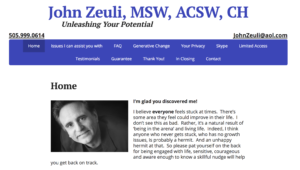
John found me by way of a Google search. We met and discussed what he wanted for a website. He handed me a multipage document and said that this was his idea for the site. He gave me what he envisioned for the entire site in one well formed document.
John didn’t want to have a lot of pictures on his site. We had one on the home page and that was enough. His vision was about having a conversation with his audience, and I think we managed that very well. The navigation is clear and attractive. Each page answers one or more questions you might have before contacting him for consultation. It works.
Here is the John Zeuli website


